TL; DR
This document demonstrates some of the functionalities of the drmr R package for fitting Dynamic Range and Species Distribution Models (DRMs and SDMs, respectively) using pre-compiled Stan models.
We will show how to:
- Visualize the estimated relationship between demographic processes and the environment
- Visualize and assess out of sample predictions
- Visualize the estimated age-specific densities
Setup
The code below loads the packages necessary to reproduce the examples in this document.
Linking to GEOS 3.12.1, GDAL 3.8.4, PROJ 9.4.0; sf_use_s2() is TRUE
This is bayesplot version 1.15.0
- Online documentation and vignettes at mc-stan.org/bayesplot
- bayesplot theme set to bayesplot::theme_default()
* Does _not_ affect other ggplot2 plots
* See ?bayesplot_theme_set for details on theme setting
Attaching package: 'dplyr'
The following object is masked from 'package:drmr':

    between
The following objects are masked from 'package:stats':

    filter, lag
The following objects are masked from 'package:base':

    intersect, setdiff, setequal, union
Data
For this example, we’ll use the package’s built-in Summer flounder dataset, which resembles the data analyzed in Fredston et al. (2025). We load it by running:
## loads the data
data(sum_fl)

## computing density
sum_fl <- sum_fl |>
  mutate(dens = 100 * y / area_km2,
         .before = y)
A quick exploration of the data reveals the following:
Finally, we split the data, reserving the last five years for evaluating predictions:
## 5 years-ahead predictions
first_year_forecast <- max(sum_fl$year) - 4

first_id_forecast <-
  first_year_forecast - min(sum_fl$year) + 1

years_all <- order(unique(sum_fl$year))
years_train <- years_all[years_all < first_id_forecast]
years_test <- years_all[years_all >= first_id_forecast]

## splitting data
dat_test <- sum_fl |>
  filter(year >= first_year_forecast)

dat_train <- sum_fl |>
  filter(year < first_year_forecast)
When fitting models with explanatory variables, it’s good practice to standardize them by centering (subtracting the mean) and scaling (dividing by the standard deviation). This transformation to zero mean and unit variance offers two main benefits: it typically improves the efficiency of Monte Carlo Markov Chain (MCMC) sampling, and it makes comparing the magnitude of regression coefficients easier for assessing relative variable importance. For applications involving forecasting or prediction, it is crucial to calculate the mean and standard deviation for standardization using only the training dataset. These exact same values must then be applied to standardize the test dataset (or any future data), simulating the real-world scenario where information about future observations is unavailable during model fitting.
In that spirit, we center and scale some of our potential explanatory variables as follows:
avgs <- c("stemp" = mean(dat_train$stemp),
          "btemp" = mean(dat_train$btemp),
          "depth" = mean(dat_train$depth),
          "n_hauls" = mean(dat_train$n_hauls),
          "lat" = mean(dat_train$lat),
          "lon" = mean(dat_train$lon))

min_year <- dat_train$year |>
  min()

## centering covariates
dat_train <- dat_train |>
  mutate(c_stemp = stemp - avgs["stemp"],
         c_btemp = btemp - avgs["btemp"],
         c_hauls = n_hauls - avgs["n_hauls"],
         c_lat   = lat - avgs["lat"],
         c_lon   = lon - avgs["lon"],
         time  = year - min_year)

dat_test <- dat_test |>
  mutate(c_stemp = stemp - avgs["stemp"],
         c_btemp = btemp - avgs["btemp"],
         c_hauls = n_hauls - avgs["n_hauls"],
         c_lat   = lat - avgs["lat"],
         c_lon   = lon - avgs["lon"],
         time  = year - min_year)
For an extensive list of the variables present in this dataset run: ?sum_fl.
Fitting models
The models fitted here will explore some of the interesting features available in the package. Auxiliary information on age-specific mortality rates and an adjacency matrix will be used to leverage the DRMs. The adjacency matrix simply indicate which patches share boarders with each other. That information may be used either for spatial random effects or to establish a movement component in the latent underlying population dynamics.
The mortality rates associated with the Summer flounder dataset are shipped with the package. The mortality rates are stored in a matrix having the number of columns corresponding to the number of timepoints in our dataset, and number of columns corresponding to the total number of age-groups observed for the species. To load that matrix in our R session, we run:
fmat <-
  system.file("fmat.rds", package = "drmr") |>
  readRDS()

## splitting between train and test for model assessment
f_train <- fmat[, years_train]
f_test  <- fmat[, years_test]
Now, we load a shapefile associated with the patches used in the dataset to construct the adjacency matrix:
## loading map
shp_sum_fl <- system.file("maps/sum_fl.shp", package = "drmr") |>
  st_read()
Reading layer `sum_fl' from data source
  `/home/runner/work/_temp/Library/drmr/maps/sum_fl.shp' using driver `ESRI Shapefile'
Simple feature collection with 10 features and 3 fields
Geometry type: MULTIPOLYGON
Dimension:     XY
Bounding box:  xmin: -75.77033 ymin: 35.18407 xmax: -65.67583 ymax: 44.4013
Geodetic CRS:  WGS 84
The shp_sum_fl has one row for each patch. It is important that this dataset is ordered by the patch id, which should correspond to the patch id in the sum_fl dataset as well.
Finally, let us fit a model. The model fitted by the fit_drm call below takes into account the following:
Effort: The probability of absence (i.e., probability of observing a zero density) is a function of the number of hauls, which serves as a proxy for effort.
Recruitment: We assume the relationship between recruitment and sea surface temperature is quadratic. In addition, we also include an AR(1) term for recruitment (ar_re = "rec").
Survival: We estimate a baseline survival rate which is shared among all patches. The survival rates vary over time according to the external information provided by f_train.
Movement: We assume individuals from ages 3 to 10 may move between patches from one year to another.
Initialization: We use the survival rates to initialize the population dynamics (see the initialization vignette by running vignette("init", "drmr").
algo_args <- list(parallel_chains = 2,
                  chains = 2,
                  iter_sampling = 200,
                  iter_warmup = 500,
                  show_messages = FALSE,
                  show_exceptions = FALSE)

drm_rec <-
  fit_drm(.data = dat_train,
          y_col = "dens", ## response variable: density
          time_col = "year", ## vector of time points
          site_col = "patch",
          family = "gamma",
          seed = 2026,
          formula_zero = ~ 1 + c_hauls,
          formula_rec = ~ 1 + c_stemp + I(c_stemp * c_stemp),
          formula_surv = ~ 1,
          f_mort = f_train,
          n_ages = NROW(f_train),
          adj_mat = adj_mat, ## A matrix for movement routine
          ages_movement = c(0, 0,
                            rep(1, 12),
                            0, 0), ## ages allowed to move
          .toggles = list(ar_re = "rec",
                          movement = 1,
                          est_surv = 1,
                          est_init = 0,
                          minit = 1),
          algo_args = algo_args)
The default algorithm for posterior sampling is Stan’s NUTS. You can control its settings by passing a named list to the algo_args argument in fit_drm. Other available algorithms for inference are covered in a deficated vignette. For further details, see vignette("algos", "drmr").
Now, we also fit an alternative model with only one difference: it assumes the survival rates vary according to the sea bottom temperature, while recruitment is constant across patches (but varies over time). We will do it using the update method. In that case, all the other arguments passed to fit_drm are kept the same as in the last call.
drm_srv <-
  update(drm_rec,
         formula_rec = ~ 1,
         formula_surv = ~ 1 + c_btemp + I(c_btemp * c_btemp))
Model Toggles
The fit_drm function is designed to be flexible, allowing different model features to be enabled or disabled through a set of toggles (e.g., via the .toggles argument). Below is a summary of the main toggles available:
-
est_surv: If activated (1), enables the estimation of a regression coefficient for survival (). Otherwise, this parameter is excluded from the model.
-
rho_mu: If activated (1), links the probability of absence to the mean density, represented by the parameter where .
-
movement: If activated (1), includes the probability of individuals remaining in the same patch () and activates the movement matrix routines.
-
ar_re: Determines the process for the AR(1) temporal correlation. If not "none", it enables AR(1) parameters such as temporal correlation (), AR(1) conditional standard deviation (), and associated random effects ().
-
iid_re: If not "none", incorporates patch-level independent and identically distributed (iid) random effects () and their standard deviation ().
-
sp_re: If not "none", includes patch-level Intrinsic Conditional Autoregressive (ICAR) random effects () and their standard deviation ().
For each of the random effects “toggles”, there are three alternatives to "none". We can include random effects for recruitment ("rec"), survival ("surv"), or for the response variable itself (“dens”).
Environment and demographic processes
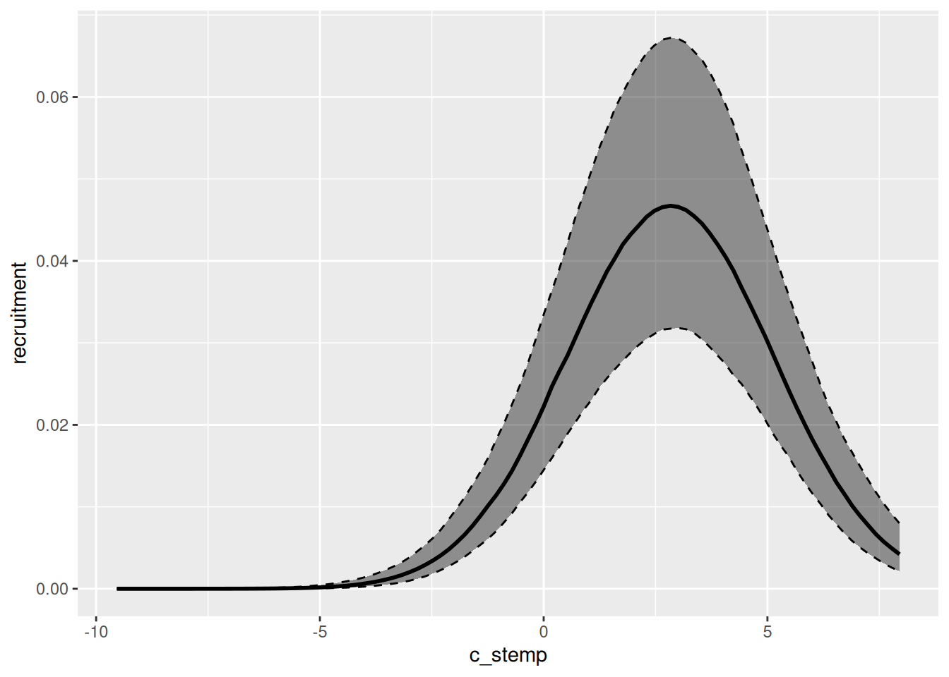
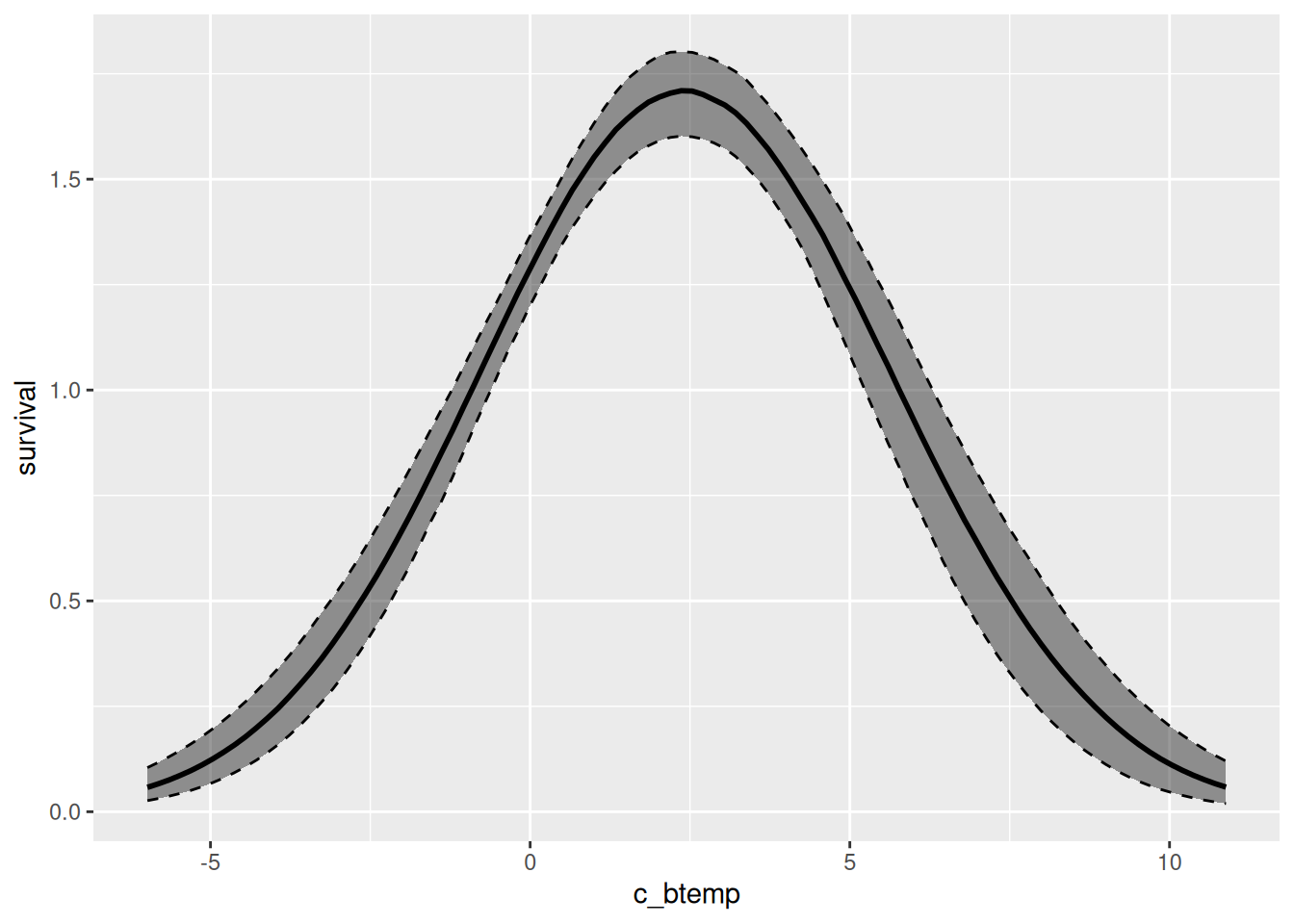
We can easily visualize the relationship between the environmental variables and specific demographic processes using the marg function. The output of that function can be plotted by simply calling the plot function. Below, we plot both the relationship between recruitment and sea surface temperature for the first model we fit, and between survival and sea bottom temperature for the second model fitted.
effects_drm(drm_rec, ## model
     process = "rec", ## demographic process
     variable = "c_stemp", ## environmental variable
     prob = .8) |> ## mass of the creible interval
  plot()
effects_drm(drm_srv, ## model
     process = "surv", ## demographic process
     variable = "c_btemp", ## environmental variable
     prob = .8) |>
  plot()
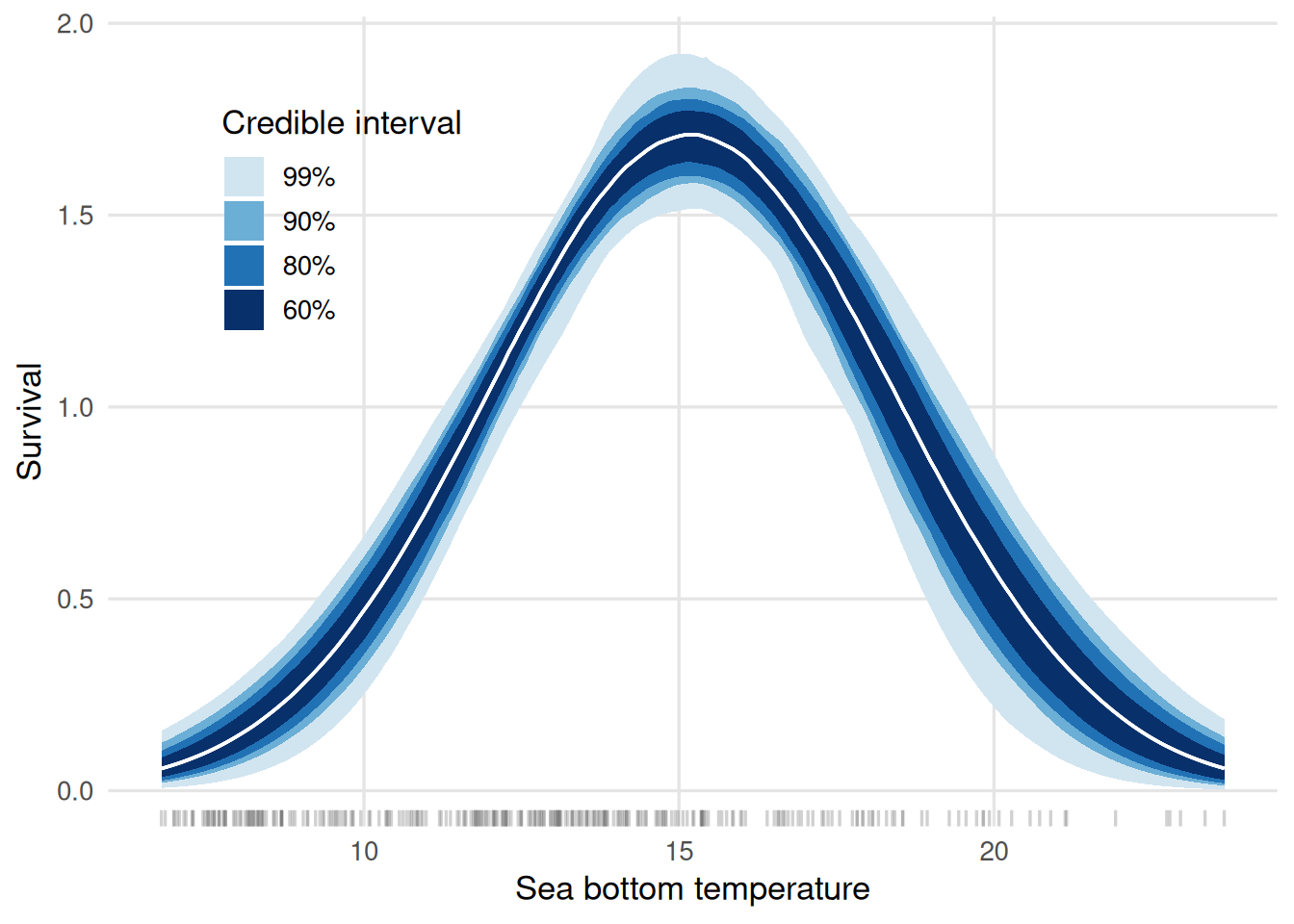
These figures display the centered environmental variables on the x-axis. We can further customize the plots to have the environmental variable on the original scale and, moreover, visualize different credible intervals at once. Below, we show how to achieve that for the survival plot:
multiple_cis <-
  effects_drm(drm_srv, process = "surv", variable = "c_btemp",
       summary = FALSE,
       n_pts = 200) |>
  lapply(c(0.6, 0.8, 0.9, 0.99),
         \(pr, .dt) {
           alpha <- (1 - pr) / 2
           probs <- c(alpha, 1 - alpha)
           .dt |>
             group_by(c_btemp) |>
             summarise(srv = median(survival),
                       low = quantile(survival, probs = probs[1]),
                       upp = quantile(survival, probs = probs[2])) |>
             ungroup() |>
             mutate(prob_mass = pr)
         }, .dt = _) |>
  bind_rows() |>
  mutate(c_btemp = c_btemp + avgs["btemp"])

ggplot(data = multiple_cis,
       aes(x = c_btemp,
           group = factor(prob_mass,
                          levels = rev(levels(factor(prob_mass)))))) +
  geom_rug(data = dat_train,
           aes(x = btemp),
           inherit.aes = FALSE,
           alpha = 0.3,
           length = unit(0.02, "npc"),
           colour = "grey40") +
  geom_ribbon(aes(ymin = low, ymax = upp,
                  fill = factor(prob_mass,
                                levels = rev(levels(factor(prob_mass))))),
              colour = NA) +
  geom_line(aes(y = srv), linewidth = 0.6, colour = "white") +
  scale_fill_manual(
    values = c("0.99" = "#d1e5f0",
               "0.9"  = "#6baed6",
               "0.8"  = "#2171b5",
               "0.6"  = "#08306b"),
    labels = \(x) paste0(as.numeric(x) * 100, "%")
  ) +
  labs(x    = "Sea bottom temperature",
       y    = "Survival",
       fill = "Credible interval") +
  theme_minimal(base_size = 13) +
  theme(
      legend.position  = "inside",
      legend.position.inside = c(.2, .75),
      panel.grid.minor = element_blank(),
      panel.grid.major = element_line(colour = "grey90")
  )
From the graph, on may infer that the temperature maximizes the survival rates is around 15 degrees Celsius.
Comparing out-of-sample predictions
The fitted values (or in-sample predictions) are obtained from the draws of the posterior predictive distribution. In general, we will be interested in summarizing those draws for visualization. The code chunk below shows how to use the fitted and summary methods to achieve that goal.
fitted_rec <- fitted(drm_rec) |>
  summary() |>
  mutate(model = "rec", .before = 1) ## creating a column that identifies the ##
Running standalone generated quantities after 2 MCMC chains, 1 chain at a time ...

Chain 1 finished in 0.0 seconds.
Chain 2 finished in 0.0 seconds.

Both chains finished successfully.
Mean chain execution time: 0.0 seconds.
Total execution time: 0.2 seconds.
                                     ## model

fitted_srv <- fitted(drm_srv) |>
  summary() |>
  mutate(model = "srv", .before = 1) ## creating a column that identifies the
Running standalone generated quantities after 2 MCMC chains, 1 chain at a time ...

Chain 1 finished in 0.0 seconds.
Chain 2 finished in 0.0 seconds.

Both chains finished successfully.
Mean chain execution time: 0.0 seconds.
Total execution time: 0.2 seconds.
The out-of-sample predictions are obtained just as easily:
predicted_rec <- predict(drm_rec,
                         new_data = dat_test,
                         past_data = filter(dat_train,
                                            year == max(year)),
                         seed = 2026,
                         f_test = f_test) |>
  summary() |>
  mutate(model = "rec", .before = 1) ## creating a column that identifies the ##
Running standalone generated quantities after 2 MCMC chains, 1 chain at a time ...

Chain 1 finished in 0.0 seconds.
Chain 2 finished in 0.0 seconds.

Both chains finished successfully.
Mean chain execution time: 0.0 seconds.
Total execution time: 0.2 seconds.
                                     ## model

predicted_srv <- predict(drm_srv,
                         new_data = dat_test,
                         past_data = filter(dat_train,
                                            year == max(year)),
                         seed = 2026,
                         f_test = f_test) |>
  summary() |>
  mutate(model = "srv", .before = 1) ## creating a column that identifies the
Running standalone generated quantities after 2 MCMC chains, 1 chain at a time ...

Chain 1 finished in 0.0 seconds.
Chain 2 finished in 0.0 seconds.

Both chains finished successfully.
Mean chain execution time: 0.0 seconds.
Total execution time: 0.2 seconds.
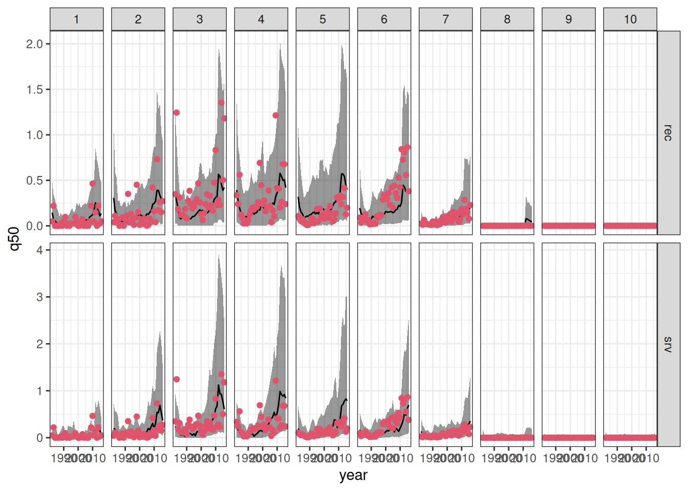
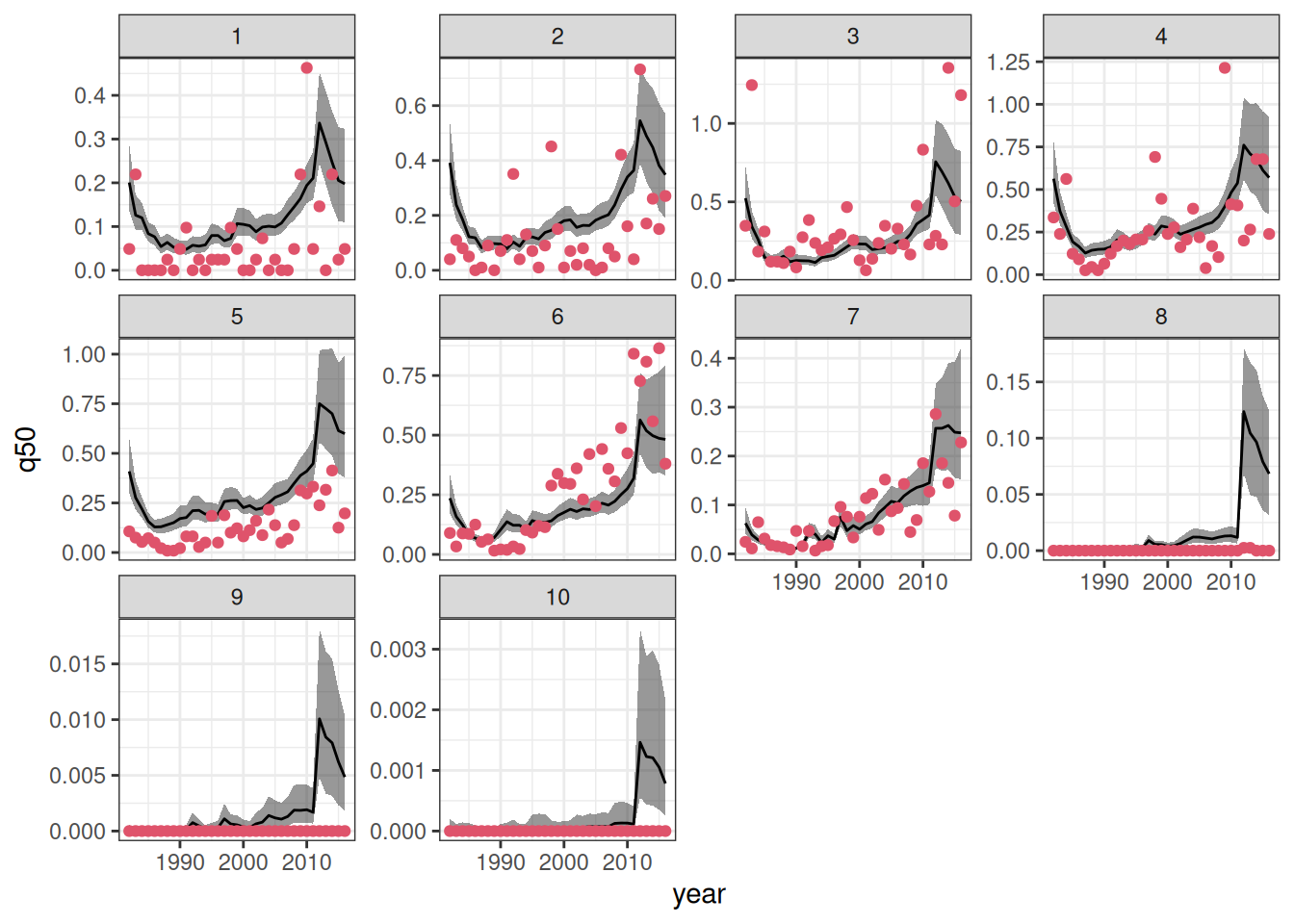
We can now combine the in- and out-of-sample predictions to visualize the results. Moreover, we will join the predictions outputs to the original data to enhance the visualizations.
combined_sfl <-
  bind_rows(fitted_rec, predicted_rec,
            fitted_srv, predicted_srv) |>
  mutate(patch = as.integer(patch)) |>
  left_join(sum_fl, by = c("patch", "year"))


ggplot(data = combined_sfl,
       aes(x = year)) +
  geom_ribbon(aes(ymin = q5, ymax = q95),
              alpha = .5) +
  geom_line(aes(y = q50)) +
  geom_point(aes(y = dens), color = 2, pch = 19)+
  facet_grid(model ~ patch, scales = "free_y") +
  theme_bw()
We can objectively compare the predictions as well.
`summarise()` has regrouped the output.
ℹ Summaries were computed grouped by type and model.
ℹ Output is grouped by type.
ℹ Use `summarise(.groups = "drop_last")` to silence this message.
ℹ Use `summarise(.by = c(type, model))` for per-operation grouping
  (`?dplyr::dplyr_by`) instead.
| in-sample |
rec |
0.1336298 |
| in-sample |
srv |
0.1436815 |
| out-of-sample |
rec |
0.3331257 |
| out-of-sample |
srv |
0.3448098 |
As expected, in-sample predictions have lower root mean square error (RMSE) of prediction when compared to their out-of-sample counterpart. In both cases, the model that relates recruitment to the environment has lead to better predictive performance (in terms of RMSE).
Projections under unknown effort
Often, you may want to project the abundance (measured here as density) of a species over time. However, since future sampling effort is unknown, it is crucial to isolate this source of variation.
drmr can handle this by projecting the latent density. Latent density represents the true, unobserved population at a given site. Because our models assume that observed data captures only a subset of the total population at a given site and time, the latent density acts as a proxy for true abundance and will consistently exceed the observed abundance. Furthermore, because it isolates the underlying biological process from observation error, the latent density trajectory tends to be much “smoother”.
You can compute the in- and out-of-sample latent abundances by passing the type = "latent" argument to the fitted and predict functions:
Running standalone generated quantities after 2 MCMC chains, 1 chain at a time ...

Chain 1 finished in 0.0 seconds.
Chain 2 finished in 0.0 seconds.

Both chains finished successfully.
Mean chain execution time: 0.0 seconds.
Total execution time: 0.2 seconds.
predicted_rl <- predict(drm_rec,
                        new_data = dat_test,
                        past_data = filter(dat_train,
                                           year == max(year)),
                        seed = 2026,
                        f_test = f_test,
                        type = "latent") |>
  summary()
Running standalone generated quantities after 2 MCMC chains, 1 chain at a time ...

Chain 1 finished in 0.0 seconds.
Chain 2 finished in 0.0 seconds.

Both chains finished successfully.
Mean chain execution time: 0.0 seconds.
Total execution time: 0.2 seconds.
combined_rl <- bind_rows(fitted_rl, predicted_rl)
Now, we can visualize those:
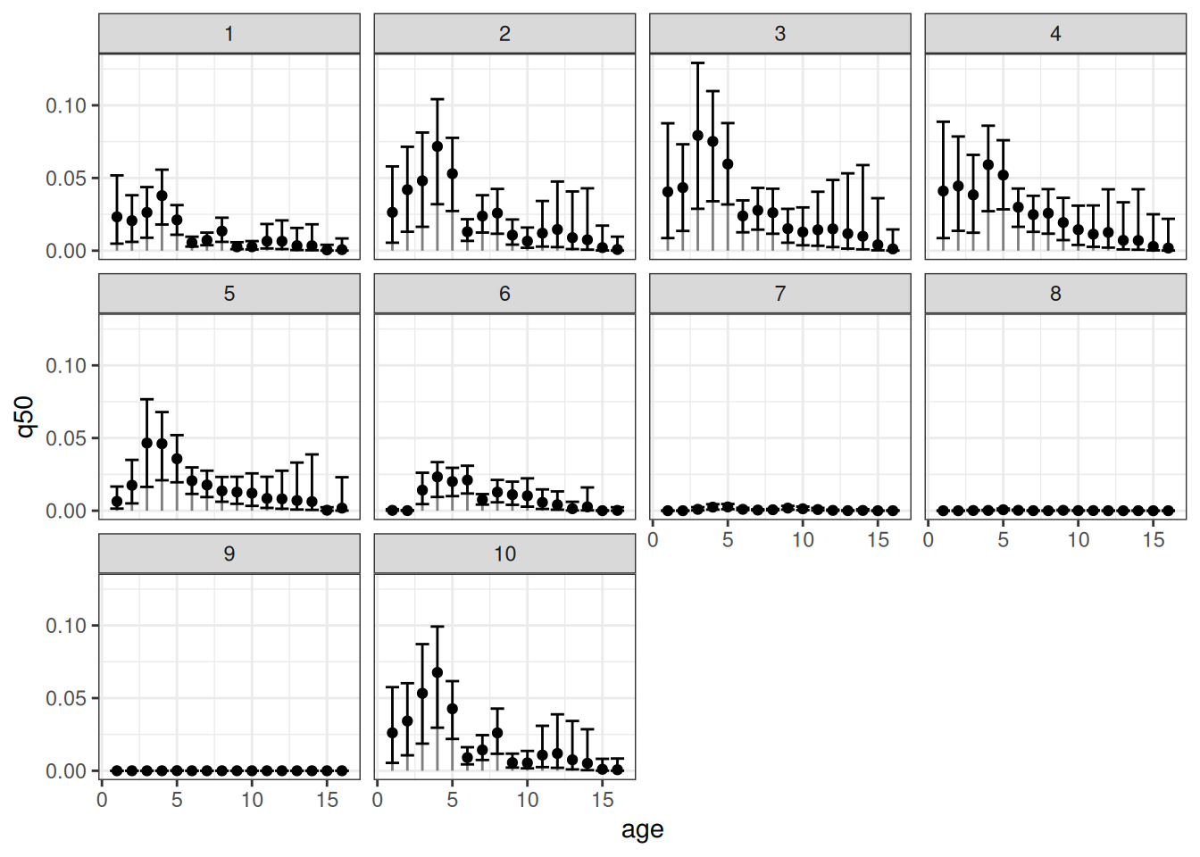
Visualizing age specific densities
Our package also allows for estimating the age-specific densities. To compute those, one can simply run:
Running standalone generated quantities after 2 MCMC chains, 1 chain at a time ...

Chain 1 finished in 0.0 seconds.
Chain 2 finished in 0.0 seconds.

Both chains finished successfully.
Mean chain execution time: 0.0 seconds.
Total execution time: 0.6 seconds.
Now, let’s visualize the age-specific densities for all patches at a given year:
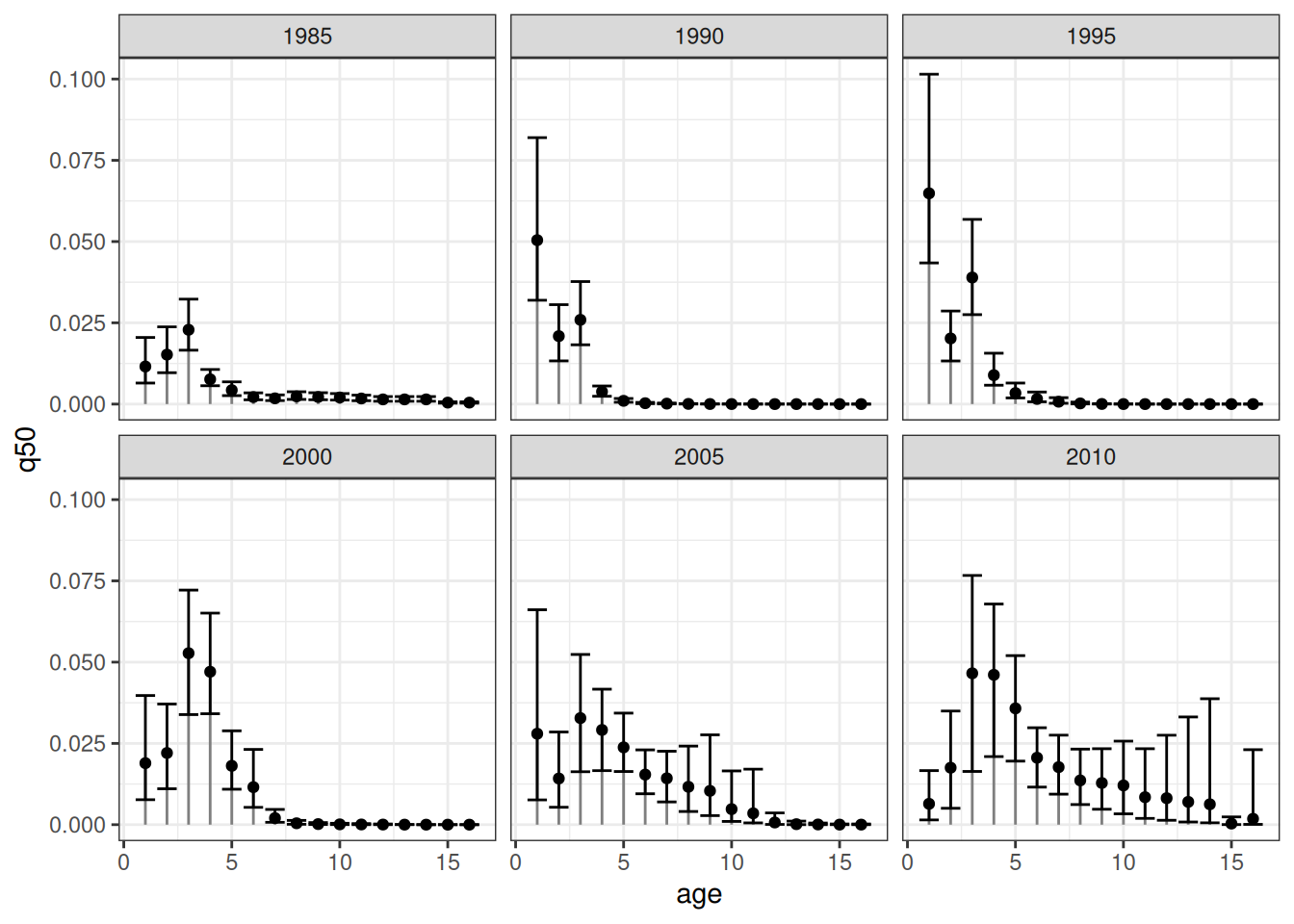
The error bars represent the respective 90% credible intervals. An equivalent visualization for a single patch across time can be obtained as follows:
References
Fredston, Alexa, Daniel Ovando, Lucas da Cunha Godoy, et al. 2025.
Dynamic Range Models Improve the Near-Term Forecast for a Marine Species on the Move. Vol. 00.
https://doi.org/10.32942/X24D00.